CSS box-sizing on mobile
When working on Tuist previews, I was checking out the website on mobile and noticed that the content was scrolling horizontally – but it took me a bit before I figured out why.
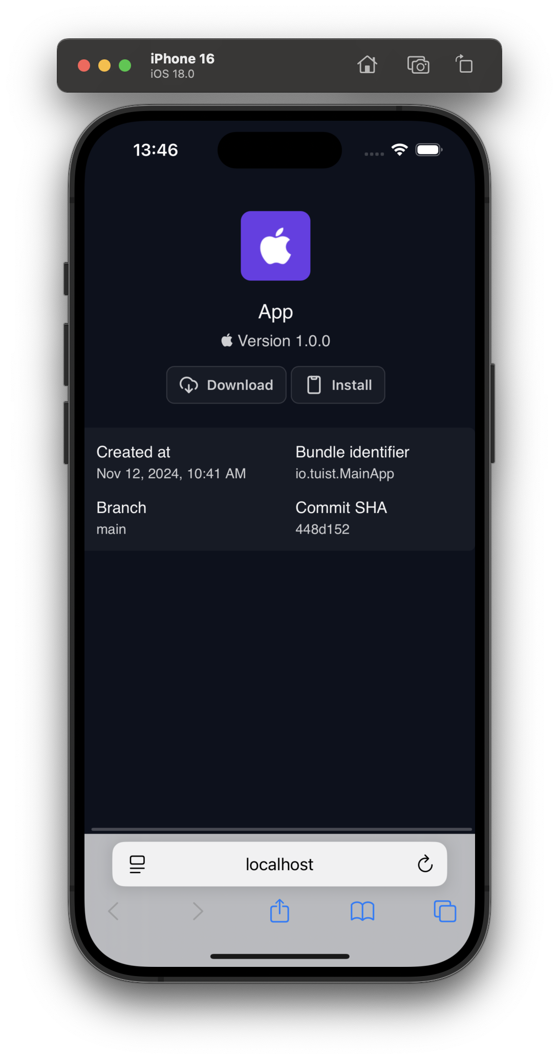
The screen initially looked like this:

There are two issues, both related:
- There is no padding between the rounded content with the preview metatada
- The content is scrolling horizontally.
The code that ends up stretching the content over the viewport looks roughly like this:
<style>
    ...

    .preview__metadata {
        display: flex;
        flex-direction: column;
        padding: 16px;
        width: 100%;
    }
</style>

<div class="preview">
  <div class="preview__metadata">
    <h2 class="preview-metadata__title">Title</h2>
  </div>
</div>
Commenting out either padding or width would fix the content overflowing the viewport horizontally. But ... why? When the preview__metadata is set to width: 100%?
CSS box-sizing #
Turns out, my mental model of how the width in CSS is computed was not in line with the default. As described in the docs for box-sizing, the default behavior is content-box: "If you set an element's width to 100 pixels, then the element's content box will be 100 pixels wide, and the width of any border or padding will be added to the final rendered width, making the element wider than 100px." In other words, CSS computes the width of the element based on the content, the padding and border are then added as extra to the final width.
To get, in my opinion more intuitive behavior, you can set box-sizing: border-box which tells the browser to include the padding and border in the width of the element. Some folks actually make this property the default for all elements in their CSS resets, like Josh Comeau:
*, *::before, *::after {
  box-sizing: border-box;
}
Sure enough, if you compare Josh's example to my code, it boils down to the same structure:
See the Pen Untitled by Marek Fořt (@fortmarek) on CodePen.
Note how the inner box is smaller than the outer one even though its width is set to 100%.
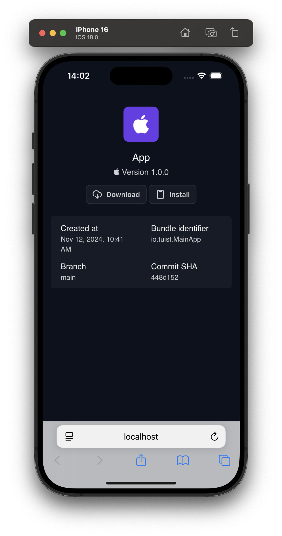
If the same reset is added to my example (or box-sizing: border-box is set directly to the preview__metadata class), our Tuist Preview page has padding with no horizontal overflow:
